

Starting with the general meaning of colors, the effect they have on people and ending with associating that with interior design. Most of the interior designers know about how and when to use a certain color.
You want to open a new location and you can’t decide on the colors? Maybe this article will make you figure it out. Be careful not to use your favorite color, maybe that is not the right decision. In order to make people feel good, you have to learn a few characteristics of colors and the psychological elements.
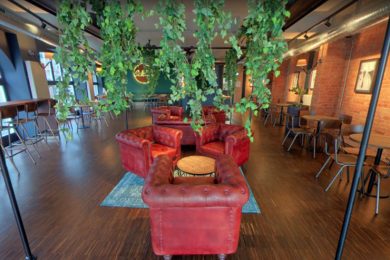
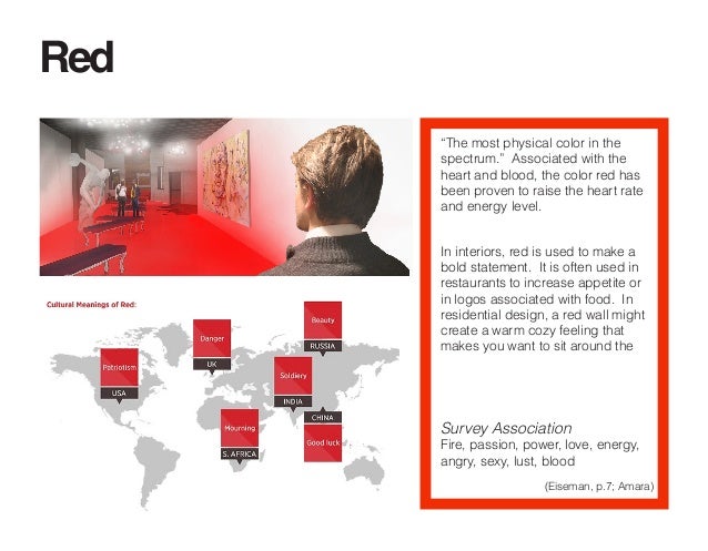
Color RED for your location:
Everybody knows that red is the color of passion, what they don’t know is the fact that red stimulates and raises the pulse rate, the time passes by faster and it makes the objects stand out very easily. If used in proper proportions it can be a pure and strong color but if not, it can be aggressive and demanding. When you want something to stand out, you can use bright or dark colors and a little something red. It can be either some decorations, an armchair or the name of the location. Another important thing is the fact that red, like orange, increases the appetite. ( According to Eiseman, p.7; Amara)
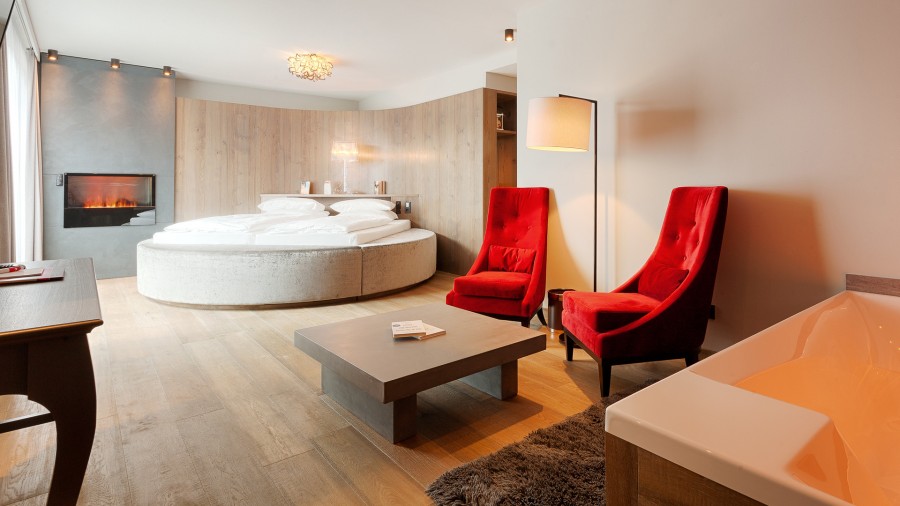
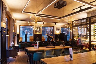
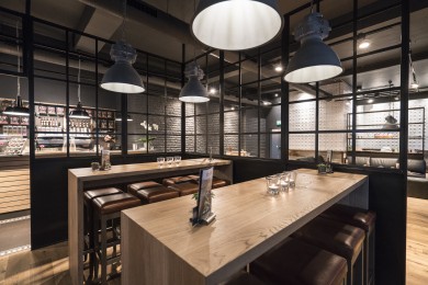
Hotel Bodenmaiser Hof, Bodenmais
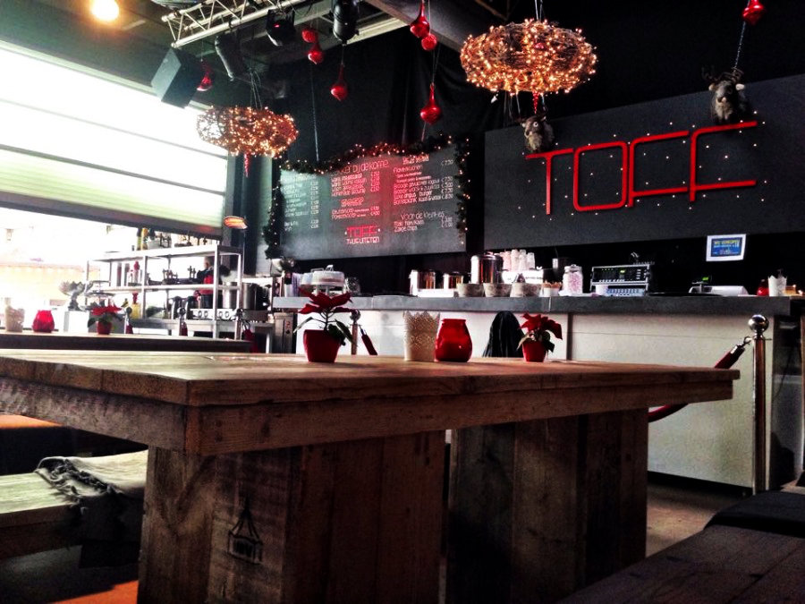
Gastrobar Tof, Venray
Color GREEN for your location:
The most balanced color is green, it suggests the feeling of nature, a bridge between the warm and the cold colors. Green represents life, the environment and outdoors, therefore used in the right way it brings harmony and peace. ( According to Eiseman, p. 37; Amara)
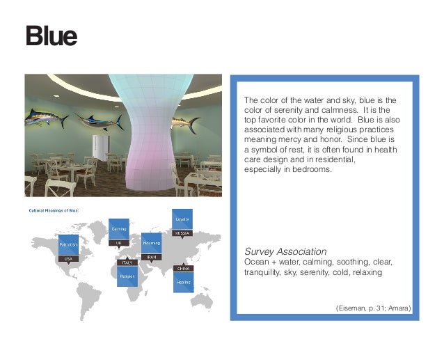
Color BLUE for your location:
It is known that blue is the color of sky and water, that means expressing a calm and refreshing feeling. The strong blue stimulates clear thought and the soft blue calms the mind. Blue also makes people feel trust in association with a product but not used right can bring coldness or lack of emotion. You can see below, an example of a location that makes you feel calm, the dominant color being light blue. (According to Eiseman, p. 31; Amara)
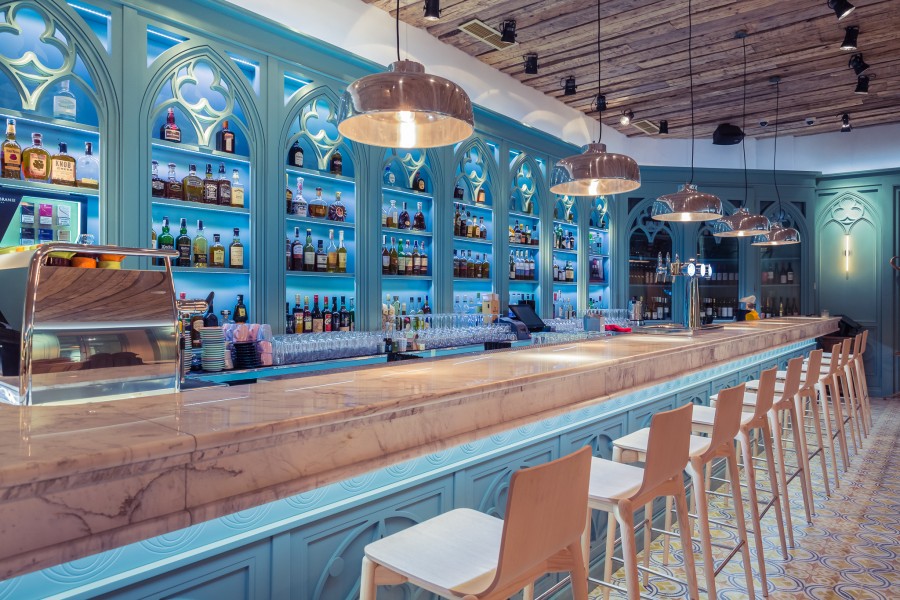
Casa Boema, Cluj-Napoca
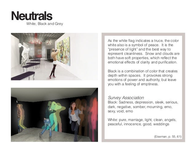
Color GREY for your location:
A neutral color would be grey. If you want a professional look, we recommend using grey. Heavy use of grey, being the dominant color will make people feel fear, lack of confidence or even depression. It is the only color that has no psychological connections if it is used in proper combination. It is the color between black and white, that means not standing out too much or being unnoticeable. ( According to Eiseman, p. 55, 61 )
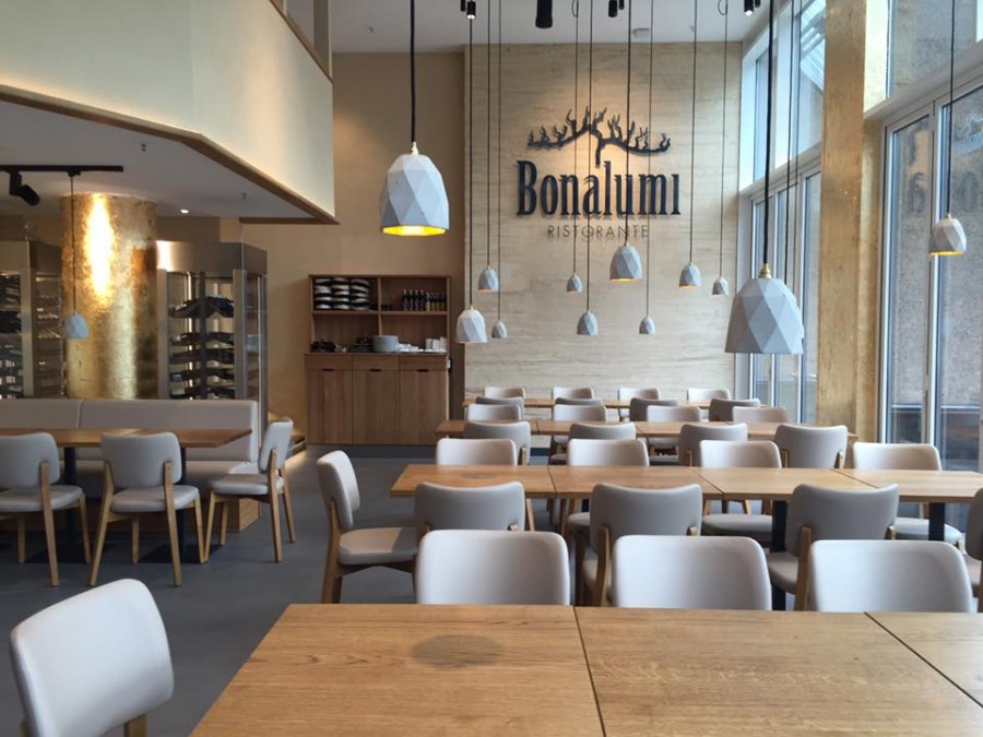
Bonalumi, Düsseldorf
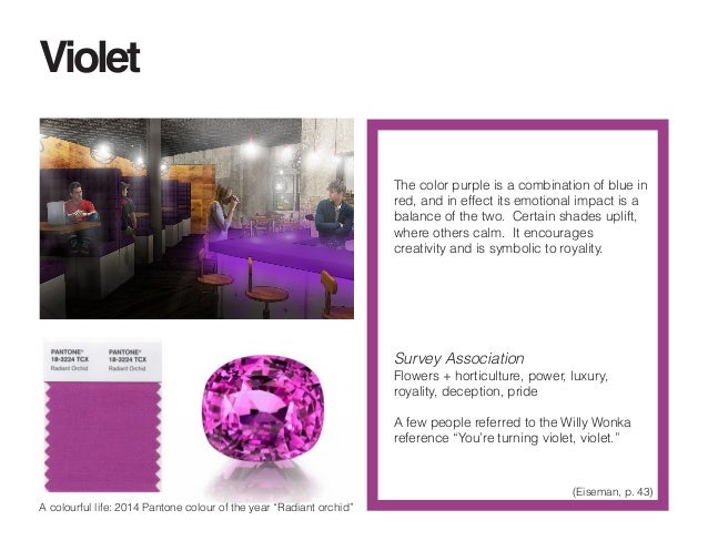
Color PURPLE for your location:
The luxurious look is given by purple, the color of royalty and extravagance. Using the wrong tone, or too much of this color can give a cheap look very easily. It can also symbolize creativity. ( According to Eiseman, p. 43 )
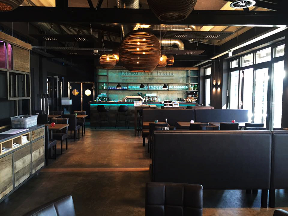
Ristorante Italia, Flensburg
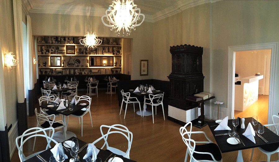
Color BLACK for your location:
The right color for getting a sophisticated and elegant look is black. Sometimes it absorbs the energy and creates barriers, but most of the times it represents mystery, as the meaning of it is darkness, not knowing what to expect.
Becks restaurant |bar | lounge , Pfullingen
Color WHITE for your location:
On the other side, there is white, which express purity and cleanliness. It goes very well with black and visually stands out, draws out the elements of more stimulating colors.
Ketschauer Hof Hotel, Deidesheim
Il locale, Bucharest
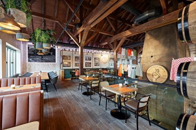
Color BROWN for your location:
The feeling of nature is expressed by brown. It gives a serious feeling, but it is also warm, solid and makes you feel comfortable. Brown is the color of leather or wood and to get a vintage or industrial look you get to use it. Associated with green it makes you feel like you are one with nature. Used mostly for outdoors but also indoors, it is the perfect combination.
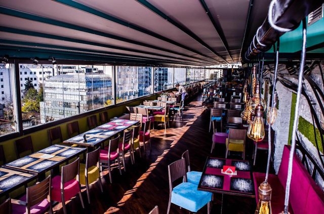
Chillers, Frankfurt
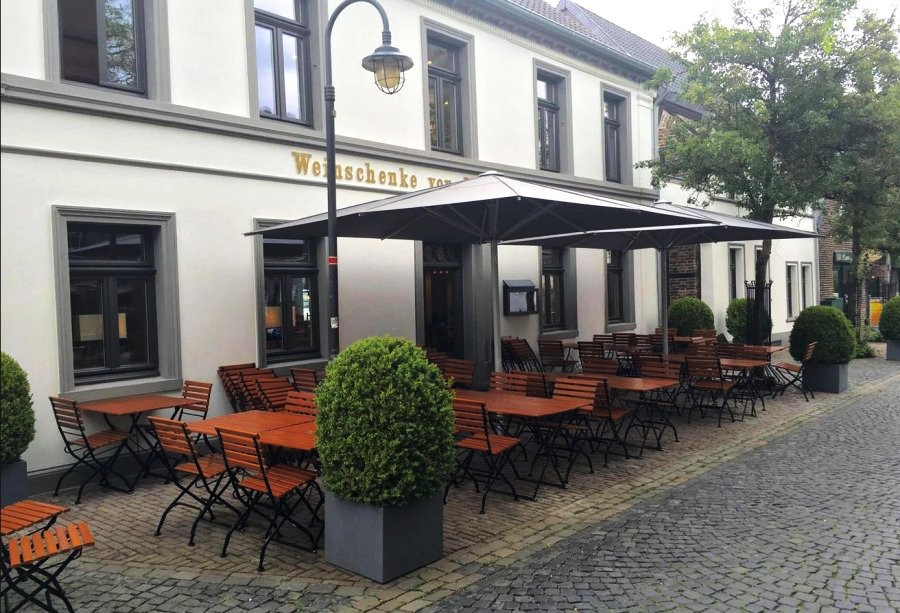
Alte Weinschenke, Meerbusch
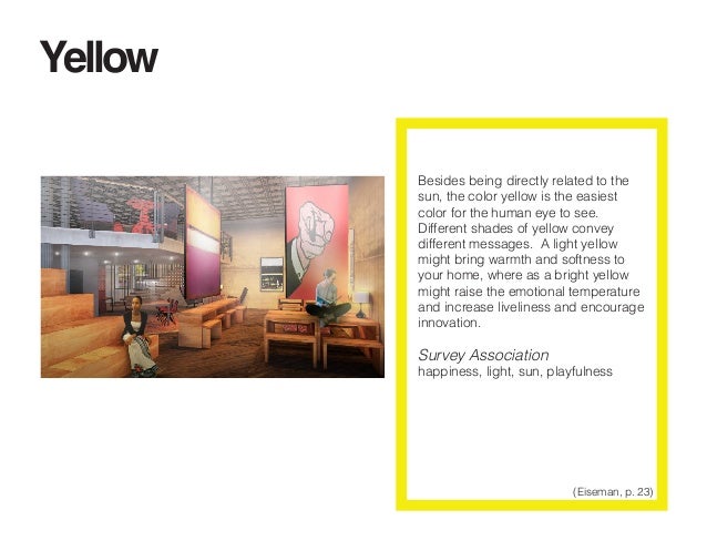
If you want to make people feel confident and optimistic, you should use yellow in the right amount. It is the color that can stimulate and vitalize, yet too much use of it or the wrong tone can cause fear or other potential negative feelings. ( According to Eiseman, p. 23 )
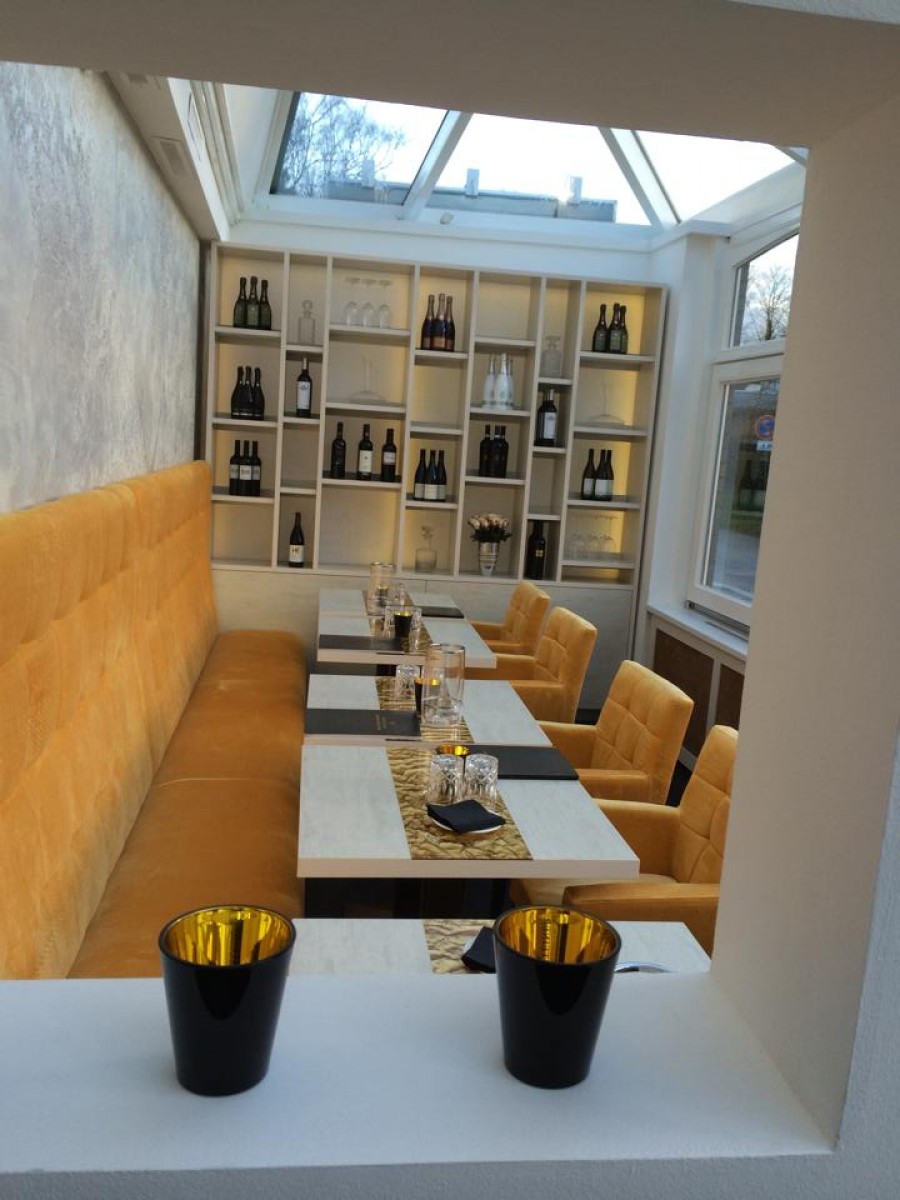 Gold and Grey, Seevetal
La Folie, Iasi
Colors have a lot of power. They have a very important role in our lives. Once you have an idea about the effect they have on people, you can choose wisely and decide on the mood you want to transmit.
Play with the colors, the combinations are numerous, don’t settle with just one or two, mix them together in order to make people feel good.